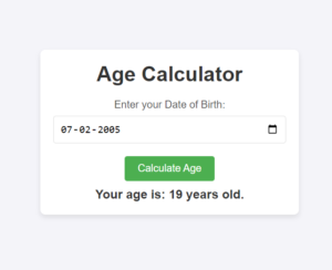
In the world of web design, user experience plays a pivotal role in determining the effectiveness of a website. One of the most important aspects of creating an intuitive and easy-to-navigate website is the implementation of a well-designed dropdown menu. Dropdown menus help in organizing content efficiently, saving valuable screen space, and improving accessibility.
In this blog post, we’ll walk you through the process of creating a stylish and responsive dropdown menu using pure CSS. This simple yet functional menu design can be customized further to fit any web project.
Why Use Dropdown Menus?
Dropdown menus are an excellent choice for organizing multiple links or options within a limited space. They’re often used in navigation bars or as part of a sidebar. The benefits of dropdown menus include:
- Improved User Navigation: Dropdowns make it easy to categorize options or links under a single button, making it quicker for users to find what they’re looking for.
- Space Efficiency: They conserve screen real estate by displaying content only when needed, rather than cluttering the page.
- Enhanced Aesthetics: A well-designed dropdown can make your website look sleek and professional.
Creating a Simple CSS Dropdown Menu
Let’s dive into the HTML and CSS code required to create a simple, attractive dropdown menu that you can easily implement on your website.
HTML Structure
First, we’ll need to structure the HTML for the dropdown. Here’s how you can set up your basic dropdown:
<!DOCTYPE html>
<html lang="en">
<head>
<meta charset="UTF-8">
<link rel="stylesheet" href="style.css">
<meta name="viewport" content="width=device-width, initial-scale=1.0">
<title>Document</title>
</head>
<body>
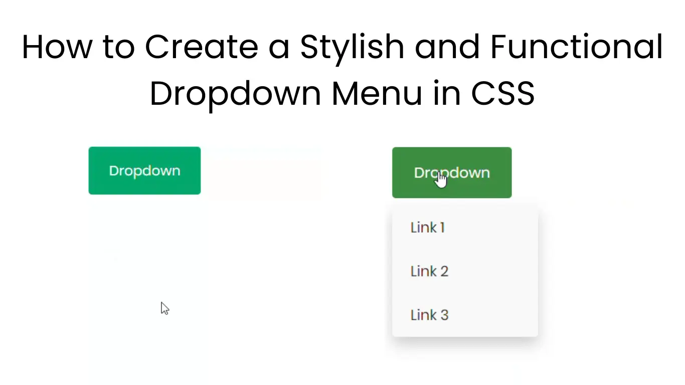
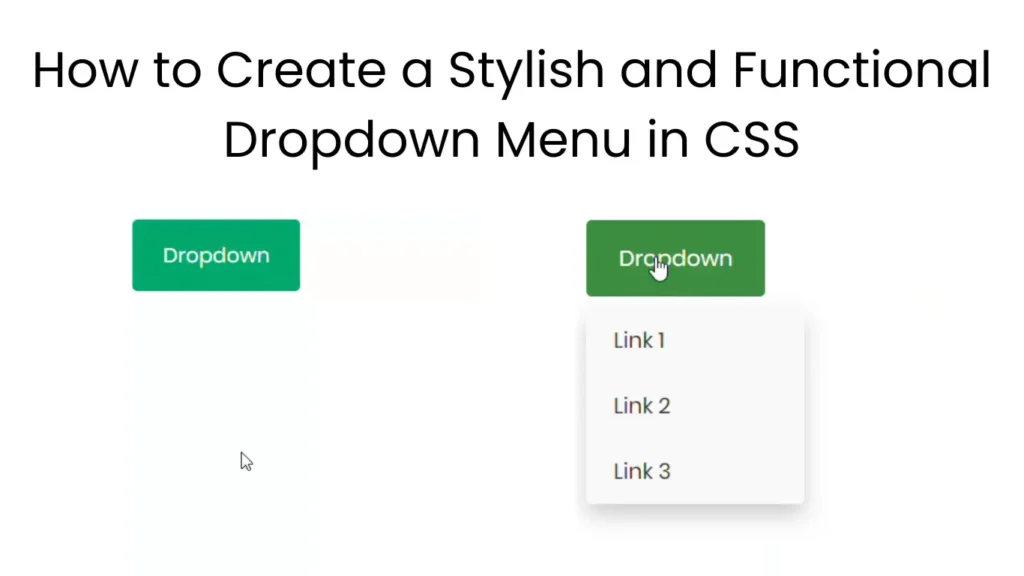
<div class="dropdown">
<button class="dropdown-btn" aria-haspopup="true" aria-expanded="false">Dropdown</button>
<div class="dropdown-menu" aria-labelledby="dropdown-button">
<a href="#">Link 1</a>
<a href="#">Link 2</a>
<a href="#">Link 3</a>
</div>
</div>
</body>
</html>In this structure:
- The
<div class="dropdown">contains the button and the content (links) that will be displayed when the dropdown is activated. - The button
<button class="dropbtn">acts as the trigger for the dropdown. - The
<div class="dropdown-content">contains the individual links, and it will remain hidden until the dropdown is hovered.
CSS Styling
Now, let’s style the dropdown using CSS to give it a sleek, modern appearance.
*{
    font-family: Poppins;
}
/* Dropdown Button */
.dropdown-btn {
    background-color: #04AA6D;
    color: white;
    padding: 16px 24px;
    font-size: 16px;
    border: none;
    cursor: pointer;
    display: inline-block;
    border-radius: 4px;
    transition: background-color 0.3s ease;
  }

  /* Hover effect for the button */
  .dropdown-btn:hover,
  .dropdown-btn:focus {
    background-color: #3e8e41;
  }

  /* The container <div> - positioning the dropdown content */
  .dropdown {
    position: relative;
    display: inline-block;
  }

  /* Dropdown Menu (hidden by default) */
  .dropdown-menu {
    display: none;
    position: absolute;
    background-color: #f9f9f9;
    min-width: 160px;
    box-shadow: 0 8px 16px rgba(0, 0, 0, 0.2);
    z-index: 1;
    border-radius: 4px;
    margin-top: 8px; /* Add a small gap between the button and the dropdown */
  }

  /* Links inside the dropdown menu */
  .dropdown-menu a {
    color: #333;
    padding: 12px 20px;
    text-decoration: none;
    display: block;
    transition: background-color 0.3s ease;
  }

  /* Change color of dropdown links on hover */
  .dropdown-menu a:hover,
  .dropdown-menu a:focus {
    background-color: #ddd;
    color: #333;
  }

  /* Show the dropdown menu when the parent container is hovered */
  .dropdown:hover .dropdown-menu {
    display: block;
  }

  /* Accessibility for focusable elements */
  .dropdown-btn:focus {
    outline: none;
    box-shadow: 0 0 0 3px rgba(72, 133, 255, 0.5); /* Provide visible focus state */
  }

  /* For mobile responsiveness, ensure the dropdown takes full width */
  @media screen and (max-width: 768px) {
    .dropdown-menu {
      min-width: 100%; /* Dropdown menu takes full width on smaller screens */
    }
  }
Explanation of the CSS Code:
- Dropdown Button Style (
.dropbtn):- We apply a green background color (
#04AA6D), set the text color to white, and add some padding for a comfortable clickable area. - We also set the font size to 16px and remove the border for a clean, modern look.
- We apply a green background color (
- Dropdown Container Style (
.dropdown):- The container is set to
relativepositioning so that the dropdown content can be positioned absolutely relative to it.
- The container is set to
- Dropdown Content Style (
.dropdown-content):- By default, the dropdown content is hidden (
display: none). - It is positioned absolutely, meaning it will appear directly below the dropdown button when revealed.
- We also apply a subtle box shadow for a more polished, three-dimensional look.
- By default, the dropdown content is hidden (
- Link Styling (
.dropdown-content a):- We style the individual links with black text and add padding to make the links easier to click.
- We remove the default text decoration (underlines) and make the links block-level elements so they span the width of the dropdown.
- Hover Effects:
- When a user hovers over a link, we change its background color to a light gray (
#ddd), indicating it’s clickable. - When the user hovers over the dropdown button, the background color of the button changes to a darker green (
#3e8e41), signaling that the menu is active.
- When a user hovers over a link, we change its background color to a light gray (
- Dropdown Visibility:
- The key interaction here is that when the user hovers over the
.dropdowncontainer, the.dropdown-contentis displayed (display: block).
- The key interaction here is that when the user hovers over the
Making It Responsive
To ensure that your dropdown menu works well on mobile devices, you can add media queries to adjust its behavior on smaller screens. Here’s an example of how to make the dropdown more mobile-friendly:
@media screen and (max-width: 600px) {
  .dropdown-content {
    min-width: 100%; /* Make dropdown span full width on small screens */
  }
}
This simple tweak ensures that on screens smaller than 600px, the dropdown content takes up the full width of its container, making it easier to interact with on touch devices.